Visualizing time-series results as calendar heatmaps with R Integration
 Christoph Werner / Jul 1, 2020
In previous tips, I’ve shown you different ways that SIMUL8’s R Integration feature can be used to create new and engaging visualizations of simulation results. These examples include heatmaps for spatial results and treemaps for more in-depth group comparisons, such as production lines and their individual components.
In this post, I’ll expand show you another useful way to visualize results over time/time-series results with R. For example, this might be resource utilization per day, weekly throughput on an End Point or a daily Average Queueing size.
Why visualize results with R?
How you choose to visualize simulation results can have a powerful impact on the success of your project. Visualizing results can better highlight the most important findings and help improve stakeholder understanding and buy-in, even if they aren’t directly involved in your simulation project.
SIMUL8 has a range of powerful, built-in features to visualize main results of your simulations and customize results in different ways, but with the ability to also export any internal spreadsheet to R and run a script using this data (without even having to open R), the options for result visualization becomes almost limitless!
To help illustrate this, let’s look at an example of creating a calendar heatmap to visualize time-series result from SIMUL8.
An example simulation of resource utilization per day
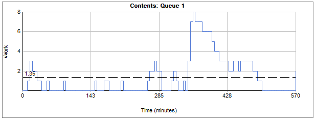
A common way to analyze the performance of a process is to look at how certain results change over time. For example, you might want to look at how queue sizes change over time to identify any patterns or bottlenecks:
Or, you could look at the number of resources working over time:
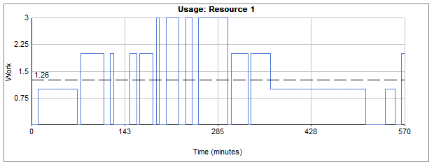
These results and graphs are readily available in SIMUL8 but sometimes you might prefer an alternative visualization for this kind of data. One example could be a calendar display combined with a heatmap to be able to quickly spot trends over days, weeks and months.
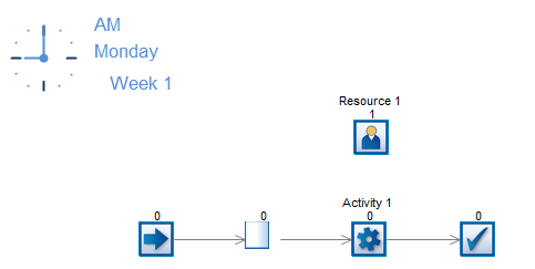
For this example, we’ll use a simple four-click model – a simulation consisting of one of each SIMUL8’s basic building blocks, Start Point, Queue, Activity and End Point. The Activity has an assigned resource which means that it can only work when at least one of this resource is available.
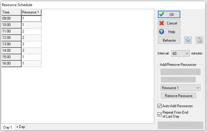
In our example, the KPI we want to analyze is the resource utilization percentage per day. The main influence on the resource utilization will be a simple schedule for the resource that tells us how many we have available for each hour of the day. This daily schedule will then repeat for each simulated day.
We can collect the resource utilization per day, our KPI of interest, by using Time Interval results. However, here we’ll use the Get Percent Utilization over Interval Visual Logic command that provides us with the same daily result in order to populate an internal spreadsheet that can be exported to R.
Our Visual Logic requires the (1) start time of the interval, (2) its end time and (3) a global variable of where to store the utilization percentage. As we are calling this command at the end of every day via Time Check logic i.e. every 480 minutes for an 8-hour day, our start time is the current simulation time minus 480, whilst the end time of the interval is simply the current simulation time. We’ll store this result is an internal spreadsheet called ‘ss_ResourceUtilizationPerDay’.

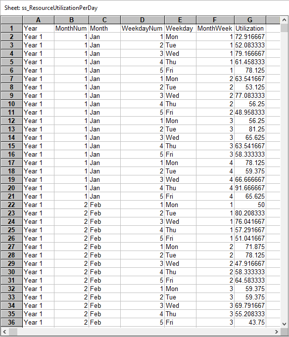
Our designated place to store the resource utilization result is column 7. We offset the row for the new result each time by 1, i.e. move down a row so that we do not overwrite any previous days’ results. The internal spreadsheet on the end of a run is shown below, with the first six columns containing our calendar data.
Connecting SIMUL8 to R to create a heatmap calendar of resource utilization
Setting up a connection to R is straightforward in SIMUL8. Check out our help files for a detailed guide on how to link SIMUL8 to R. With the connection in place you can run scripts directly from SIMUL8, using internal spreadsheets as input data, without the need to open R.
For this specific example we are using the R libraries ggplot2, plyr, scales and zoo. The internal spreadsheet ‘ss_ResourceUtilizationPerDay’ is exported on the end of the run and its data is used for the calendar heatmap in R. We’ll use the R script below to generate our visualization:

This R code will automatically install the libraries that are needed (even if they haven’t already been installed) and will use a CSV file automatically created by SIMUL8, based on the internal spreadsheet. The only requirement is that both the SIMUL8 and R file are saved in R’s working directory and write permissions are enabled in Windows.
SIMUL8 will then output the heatmap to a PDF file, making the visualization easy to embed in a presentation or share directly with stakeholders.
The final visualization of our example simulation results looks like this:
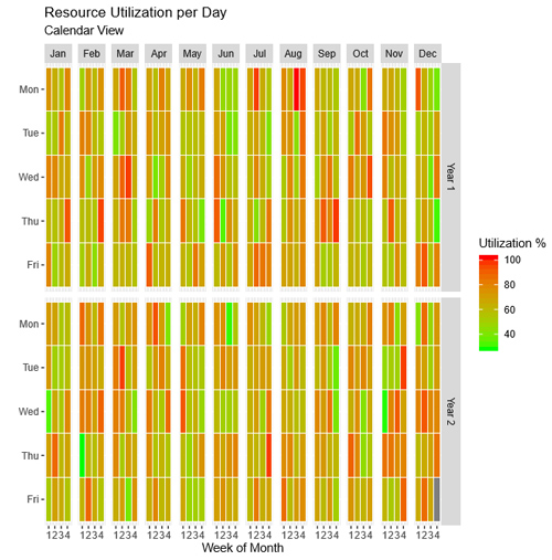
An advantage of this calendar graph is that we can easily spot patterns in our results, such as specific weekdays of high (or low) utilization or other simulation behaviors over time that are particular to a month or season.
We hope this look at how R Integration can be used to enhance result visualizations has given you some inspiration to create your own. If you have any questions or need help with the feature, get in touch with our friendly support team.
About the author
Christoph Werner
Christoph Werner has an MSc in Operational Research (distinction) from the University of Strathclyde. In 2018, he completed his PhD. Since 2018, Christoph has been working as part of our Simulation Excellence team where he has helped Simul8 users with numerous simulation projects in automotive, defense, healthcare and other service sectors.