Using SIMUL8’s R Integration to visualize results as treemap graphs
 Christoph Werner / Jul 30, 2019
We previously explored how SIMUL8 2019’s R Integration feature opens up exciting new ways to analyze and visualize your simulation results. In this post, I’ll show you how to generate treemap graphs with R.
Visualizing results in different ways can play a key role in analyzing your simulation projects. They can help you to quickly uncover new insights, provide clear communication for stakeholders and enhance engagement with your projects.
In addition to the built-in result visualization features, SIMUL8 2019 includes the ability to export and display your simulation results using the popular statistical programming language R.
In this post we’ll look at an example of visualizing a treemap graph using R, but there are many other graphs and visualization scripts to try.
Creating a treemap graph of your results
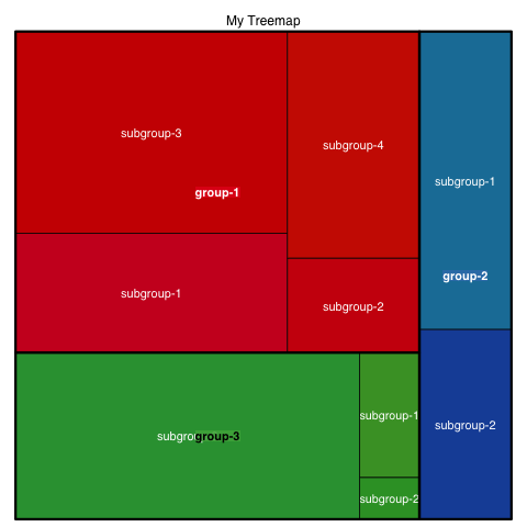
Treemaps provide a hierarchical view of your results and make it easier to spot patterns, such as best performing production lines or equipment used within them. The tree branches are represented by rectangles and each sub-branch is shown as a nested rectangle. The treemap chart displays categories by color and proximity and can easily show lots of data that can sometimes be difficult to include with other graph types.
For this example, I’ve created a simulation of four simple production lines, each consisting of four Activities together with their corresponding Queues. At the end of the simulation run, we want to generate a treemap to visualize the percentage of time that each Activity has been working, along with each production line’s aggregated working percentage.
You can download a copy of the simulation and the treemap graph R script if you’d like to try the example out for yourself.
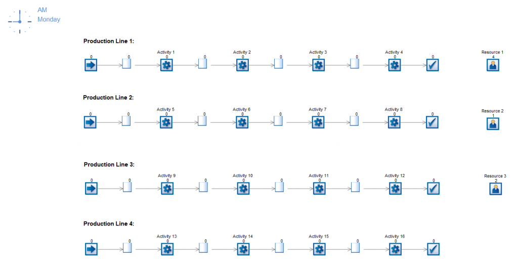
Each production line has its own inter-arrival distribution defined on its Start Point. We have kept all Activities’ distributions at the default 10 minute average cycle time. The Efficiency option of each Activity differs, with the lowest efficiency being 15% and the highest being 100%. The first three production line also have Resource requirements, with each Resource having a different availability and number available.
The data used in R and the treemap comes from an internal spreadsheet that I’ve set-up in SIMUL8.
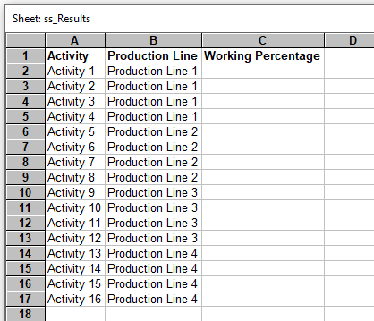
At the end of the simulation run, we then use some Visual Logic code to populate the Working Percentage column automatically for each Activity.
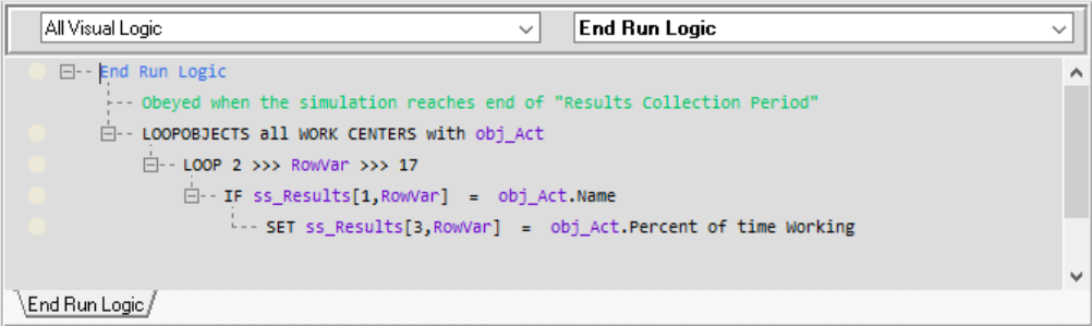
At the end of the simulation run, SIMUL8’s R connection will export the internal spreadsheet and call the R script below to generate our treemap graph.
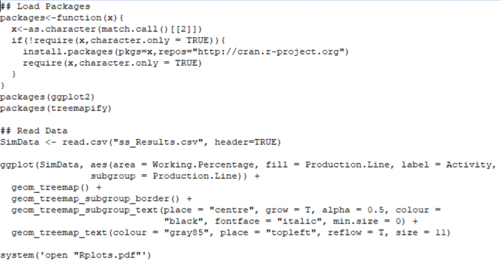
The automatic execution of R and installation/loading of its packages can be set up within SIMUL8 by choosing the location of the treemap R script (.R). We explain how to do this in more detail in the R Integration SIMUL8 Help File.
The treemap for the results generated by the simulation looks like this.
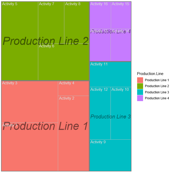
The graph shows the aggregated working percentages for each production line by the proportions of the colored squares. Within each production line square, we can see the contribution of each of its Activities. You can also customize the chart by changing the colors or displaying the result numbers on the chart itself.
We hope this example has given you inspiration to try out more result visualizations with R. If you have any questions, please get in touch with our support team by emailing support@SIMUL8.com.