SIMUL8 2019’s R Integration feature opens up exciting new ways to analyze and visualize your simulation results. We take a look at an example of this feature in action by creating a heatmap from spatial simulation results.
Visualization can play an important role when it comes to both analyzing and communicating the results of your simulations. Using different approaches to filtering, aggregating and displaying results can help you to uncover ‘golden nuggets’ of insight that could otherwise be missed. Choosing the best way to convey your simulation results will also help maximize stakeholder understanding and engagement with your project.
SIMUL8 users can already display simulation results in a range of formats, including built-in charts and custom charts. With the ability to export data to R and run an R script at the end of a simulation run or trial using SIMUL8 2019, you now have an almost limitless number of ways of visualizing your results! Best of all, R is open source and completely free to use.
From histograms, to heatmaps, to boxplots and many more, take a look at the R graph gallery to see examples of the unique and engaging visualizations you can use to output your results.
R you excited by the possibilities of this new feature? In this post, we’ll look at an example of how we can use R to export spatial simulation results as a heatmap.
An example simulation with spatial results
We’ll look at an example of a simulation that models various US states processing mail received from overseas.

An example simulation of mail being processed in different states
We have used three Start Points, each representing letterboxes from different countries. When we run the simulation, Work Items (in this case, mail) join a Queue in each state before being processed at an Activity (a mail center) and leave the simulation at an End Point when mail has been delivered to the addressee. The orange box over Washington shows how we have set up our simulation objects across all other states.
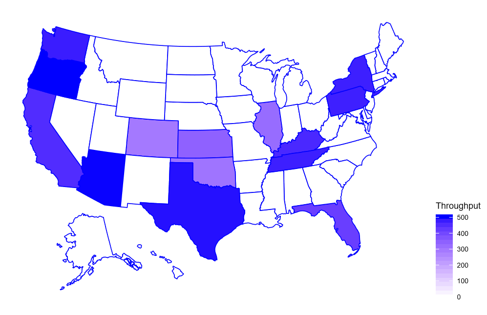
The result we want to visualize is the Number of Completed Jobs at each Activity. That is, the total number of letters that have been processed by mail centers in each state. So how do we do this?
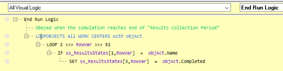
To get the numbers we need, at the end of the simulation run we could look at this number for each Activity individually by going into its Properties, selecting Results and viewing the number of Completed Jobs. To save time, we can automate this task using Visual Logic to automatically store the result for each state in an internal spreadsheet at the end of a run. We’ll show you how to set this up in the next section.
Using the new R Integration feature, we can then instruct SIMUL8 to run a specific R script so that the results stored in the simulation’s internal spreadsheet will output as a heatmap image of the different states, shown below. With this visualization, you can very quickly see the states that have processed the most overseas mail, based on our simulation results.
How to set up the visualization using R Integration
Setting up a connection to R is straightforward in SIMUL8 2019. Take a look at our R Integration Help File to learn how to get started.
For this specific visualization example, we have used the R libraries ‘ggplot2’ and ‘usmap’. These libraries use a column with the states’ names and the corresponding numerical values (in our example, the number of processed letters). We have taken these values from an internal spreadsheet at the end of the simulation run.
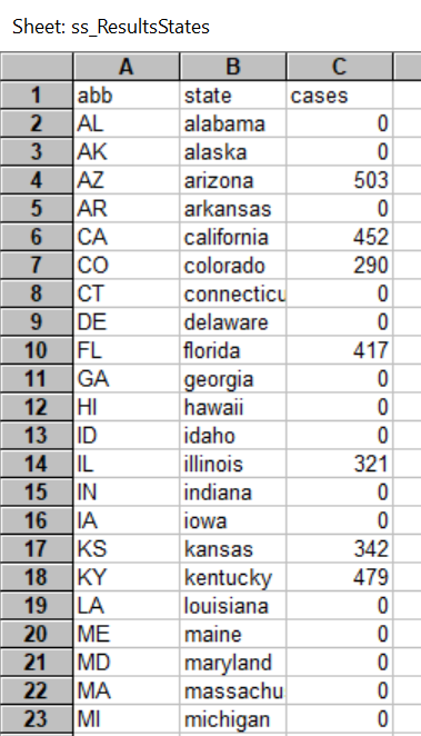
Column A (with abbreviations) is used by SIMUL8 to automatically collect results from the names of our Activities. Column B is used by the R script to identify the state.
Using this format, we can also easily add any additional states by naming them according to their abbreviation. Once an Activity has been added (using the correct naming convention), we can use the Visual Logic code below called ‘on end run’ to automatically add the results to the internal spreadsheet.
The corresponding R code to display the visualization is shown below.
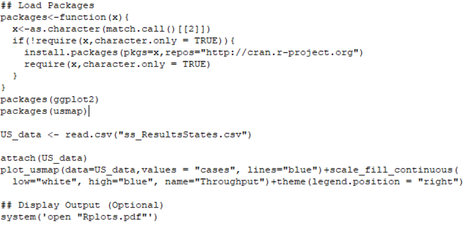
This R code will automatically install the libraries that are needed (even if they haven’t already been installed) and will use a CSV file automatically created by SIMUL8, based on our internal spreadsheet. The only requirement at this point is that both the SIMUL8 and R file are saved in R’s working directory and write permissions are enabled in Windows.
SIMUL8 will then output the heatmap graphic to a PDF file, making the visualization easy to embed in a presentation or share directly with stakeholders.
Want to try it for yourself? If you have SIMUL8 2019, download a copy of this example simulation.
An exciting new way to analyze and visualize simulation results
We hope this look at how R Integration can be used to enhance result visualizations has given you inspiration to create your own. We can’t wait to see the unique and interesting ways our users will use with this new feature!
R Integration is just one of the powerful new features available in SIMUL8 2019. Find out more about our latest release or get in touch with our team for more information.