Friday’s Tip – Use TimeView to Chart Simulation Events
We’ve got another top tip from Glenn one of our Customer Support Advocates.
This Friday Tip will show you how to use TimeView; which displays time based charts that map out what has happened in your simulation.
It can be beneficial to use TimeView to better understand what particular set of circumstances led to a particular series of events at a later time! TimeView shows a Gantt chart style view of the state of any of your simulation objects across time.
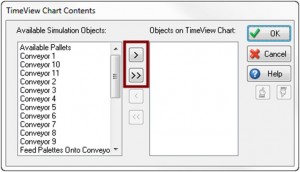
To open TimeView, navigate to the Home Tab, and select TimeView from the drop down menu on the Results button. A dialog will open, showing you all of the objects in your simulation. Use the single > button to add one object at a time, or use the double >> button to add all objects to your TimeView report.

You can change the objects listed in the TimeView report at any time using the objects button on the TimeView dialog.
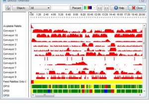
At the end of your simulation run your TimeView report will look similar to the picture below.

The TimeView results window has two axes:
- Horizontal – Time
- Vertical – Simulation Object
The vertical axis lists all the objects you have selected onto the TimeView report. In the main (colored) part of the chart you see what happened to each of the objects as the simulation progressed over time.
Here’s how to read the charts:
Queues:
- Red – Use of Capacity
- White – Unused Capacity
Activities:
- Yellow – Waiting
- Green – Working
- Red – Blocked
- Blue – Broken Down
Resources:
- White – Unused
- Green – Working
We hope you found this tip useful! Please leave your comments and feedback below.
Happy Friday!