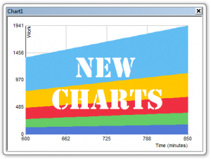
Mission Charts Control
Charts are one of the most effective ways of communicating data. In SIMUL8 our aim is to make powerful charts easy to create – in just a couple of clicks.
Charts have been in SIMUL8 since the early days and in 2006 we improved the look and feature set of charts by using a leading edge charts component (aka a plugin).
Over time we collected lots of great charts features and ideas from our customers, but unfortunately the charts component we had used didn’t come with all the source code. This meant that we didn’t have full control over charts, and we found it wasn’t possible to add all the great features and improvements you had suggested.
We decided it was time to take back control. So I set out to rework, restructure and improve our original charts code. I had a few key targets in mind before my mission commenced:
• Aesthetics – they should look at least as good as the component charts
• Speed – they must run / update faster than component charts
• Simplified – simplify the chart properties dialog
• Functionality – add new features whilst also retaining the current features
• Usability – Improve usability throughout the process
Click here to see all the new features and improvements that have been added.
I believe charts are fundamental to SIMUL8 and, the great news is that these features and improvements have been release in our latest service pack www.simul8.com/support/service_packs/ so these improvements will benefit all our customers.
I’d like to think I’ve succeeded in my mission, but you can be the judge of that. I’d love to hear your thoughts and feedback, and now that we have regained full control of charts changes are easier to make, so please feedback your ideas and suggestions to me @ info@simul8.com or email our feature requests address at support@simul8.com and I’ll be sure to hear about it.