Simulations that stand out: Design principles and top tips
![]() Simul8 / Jul 11, 2023
Simul8 / Jul 11, 2023
Our recent drop-in session with Simulation Consultant Jessica Aiani was a great success, providing invaluable insight and discussion into the art of creating captivating simulations.
In case you missed it, we’ve got you covered! Read on for the key takeaways of the session, highlighting the key principles of simulation design that can transform your simulation models into immersive and user-friendly experiences.
That’s not all. After the session, we sat down with Jessica to find out more on her favorite features and top tips for creating compelling simulations. From aesthetics to usability, we’ve gathered the essential knowledge you need to take your simulations to the next level!
Summary of our ‘Creating eye-catching simulations’ drop-in
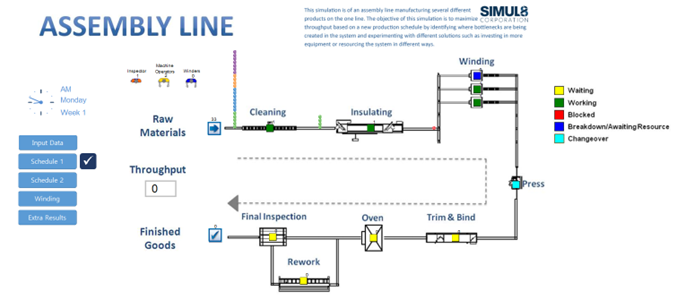
Creating stunning visuals is just the tip of the iceberg when it comes to crafting impactful simulations. In our session, we emphasized the importance of usability and highlighted key design principles to keep in mind. While aesthetics matter, the usability of a simulation should never be compromised. Imagine a visually appealing simulation that users struggle to navigate – hardly ideal. Strive for harmony and cohesion across all touchpoints, paying attention to even the smallest details.
Understanding your audience is crucial. Personalize the experience by adapting to their unique needs, goals, and preferences. Remember, one size does not fit all. To guide users seamlessly, implement a left-to-right design that aligns with their natural reading flow. Additionally, consider employing a grid-based layout to enhance scanning and information retrieval.
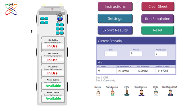
Colors play a vital role in enhancing understanding. Like spices in a dish, they add flavor and depth to your simulations. Carefully choose colors to highlight important information, create contrast, and aid interpretation. Employ visual hierarchy to emphasize key aspects, such as KPIs, and draw users’ attention effectively.

Lastly, ensure buttons are easily identifiable and clickable, avoiding any hide-and-seek frustrations. These elements act as gateways to interaction, and their design should reflect their functionality.

We then delved into some features that can help us create visually stunning and functional simulations. These include incorporating background images, utilizing graphics for objects and work items, employing Charts to simplify result interpretation, as well as including Dialogs and Buttons to enhance engagement within your simulation models.

Let’s hear more from Jessica!
Q: What are the top features you recommend for creating compelling simulations?
A: One of my favorite features is Views. Views allow simulation builders to present information and results in a more organized and cohesive manner. By separating different elements onto different “pages,” views create a clutter-free user interface and improve the overall user experience.
Q: How do views enhance the user experience?
A: Views provide a clear structure and navigation system within simulations. Users can easily switch between different Views, accessing specific information as needed. It eliminates the need for overwhelming users with all the details at once, making the simulation more digestible and engaging.
Q: Any other features you find particularly valuable?
A: Absolutely! Another feature I highly recommend is Data Bars. As a visual person, I appreciate being able to quickly grasp key simulation results. Data Bars provide a clear visual representation of data, allowing users to process information and make decisions more efficiently. Since they can easily be linked to spreadsheet cells, Data Bars dynamically update as the simulation is running, which really helps with understanding the system as a whole.
Q: Are there any underutilized features that simulation builders should explore?
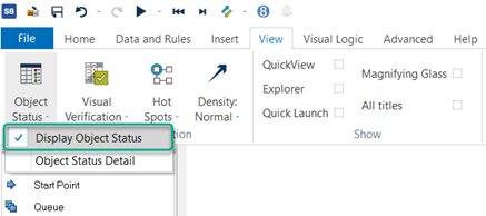
A: Object Status (View > Object Status > Display Object Status) is often overlooked, but it has immense potential. It allows users to understand what’s happening within their simulation models in more detail. Not only that, but Object Status is a valuable tool for validating and debugging simulation models when they’re not behaving as intended.

Q: Have you noticed any surprising ways users have utilized simulation features?
A: Feedback from users has been remarkable. While simulation projects tend to have a heavy focus on results, it’s inspiring to see users actively utilizing features like Tabs and Resource animations in their models. By placing emphasis on aesthetics alongside functionality, simulations become more than just data – they become visually captivating experiences.
Q: Do you have any final tips for Simul8rs who want to take their simulation models to the next level?
A: Designing aesthetically pleasing and functional simulation models is within your reach. By following the guidelines mentioned above, you can create simulations that strike the perfect balance between graphics and functionality. Remember, graphics are important, but they should enhance the simulation, not overpower it. Your simulation should shine like a well-prepared dish, where every element serves a purpose. By adhering to the principles of simulation design and utilizing the recommended features, you can elevate your simulations to new heights.
Blend usability with captivating visuals, ensuring that the user experience is seamless and engaging. Personalize the simulation experience for your audience, taking into consideration their unique needs and preferences. This personal touch will make your simulation models more relatable and impactful.
Harness the power of well-designed elements, incorporating features like Views, Data Bars, and Object Status to enhance the clarity and depth of your simulations. These features offer valuable insights and enable users to navigate and interpret the simulation with ease.
Of course, there are many more features and techniques available within Simul8 to design compelling simulations. If you’re eager to learn more, we offer a bespoke training course to help you master these techniques – get in touch with our team today to find out more!